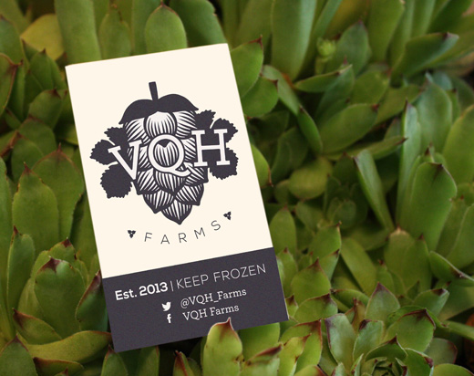
 VQH Farms BrandingBranding for VQH Farms.
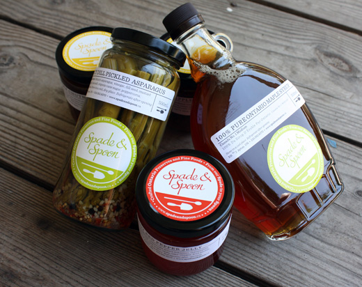 Spade & Spoon Preserves BrandingBranding for Spade & Spoon Preserves.
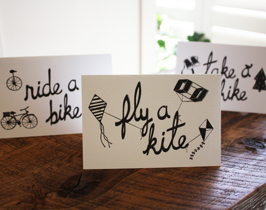 Greeting CardsDesigns for cheeky greeting cards.
 Greeting CardsDesigns for French themed greeting cards.
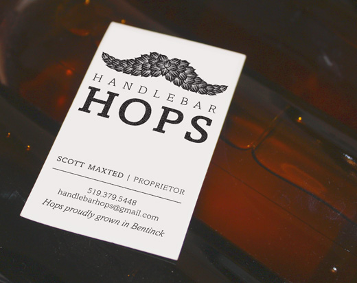 Handlebar Hops BrandingBranding for Handlebar Hops.
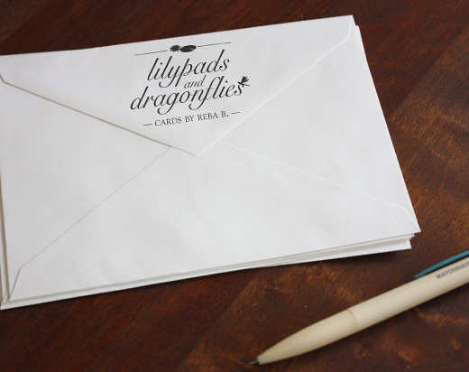 Lilypads & DragonfliesLogo design for hand-made greeting cards by Rebecca Becker.
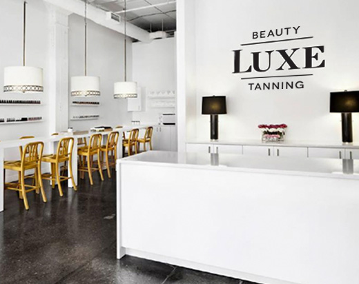 Luxe Tanning & Beauty Branding
Branding for upscale tanning and beauty salon in Libery Village. Designed under the creative direction of Joselynn Maas.
Luxe Tanning & Beauty Branding
Branding for upscale tanning and beauty salon in Libery Village. Designed under the creative direction of Joselynn Maas.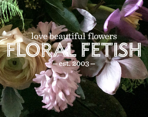 Floral Fetish Branding
Branding for design focused floral boutique. Designed under the creative direction of Joselynn Maas.
Floral Fetish Branding
Branding for design focused floral boutique. Designed under the creative direction of Joselynn Maas.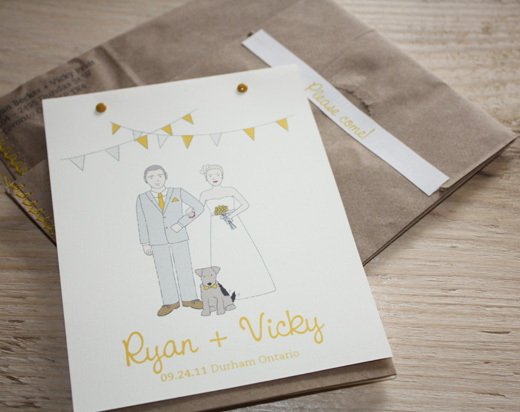 Ryan + Vicky 09.24.2011Invitation design for my wedding.
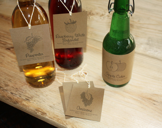 Ryan + Vicky 09.24.2011Wine label designs for my wedding.
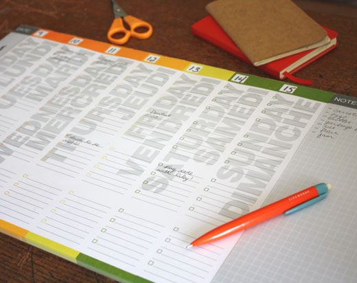 J+- Weekly PlannerFor Fall 2011. Designed under the creative direction of Joseph Mimran and in collaboration with product developers for Joseph Mimran & Associates.
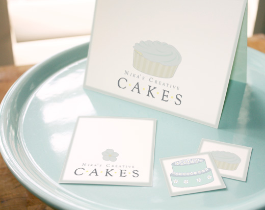 Nika's Creative Cakes Branding
Designed under the creative direction of Joselynn Maas.
Nika's Creative Cakes Branding
Designed under the creative direction of Joselynn Maas.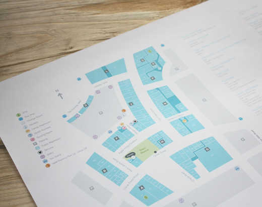 Shops at Don Mills Map
Designed under the creative direction of Joselynn Maas.
Shops at Don Mills Map
Designed under the creative direction of Joselynn Maas.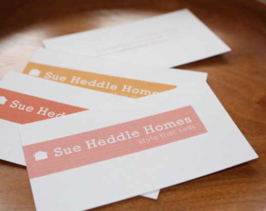 Sue Heddle Homes Branding
Designed under the creative direction of Joselynn Maas.
Sue Heddle Homes Branding
Designed under the creative direction of Joselynn Maas.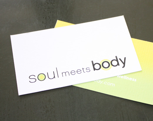 Soul Meets Body Branding
Designed under the creative direction of Joselynn Maas.
Soul Meets Body Branding
Designed under the creative direction of Joselynn Maas.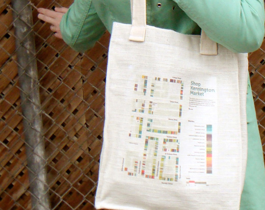 Kensington Market Wayfinding SystemThis wayfinding system works by dividing the businesses in Kensington Market into colour coded categories. By simplifying the information in this way, visitors can easily identify areas of the market of interest to them. Placing the map on a shopping bag promotes ease of use and is more durable than a paper version.
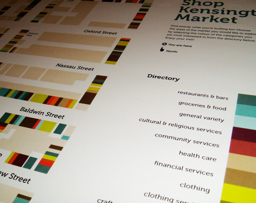 Kensington Market Wayfinding SystemThis wayfinding system works by dividing the businesses in Kensington Market into colour coded categories. By simplifying the information in this way, visitors can easily identify areas of the market of interest to them. Placing the map on a shopping bag promotes ease of use and is more durable than a paper version.
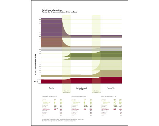 Year of the Potato Nutritional InformationThis chart compares the nutritional values of an organic potato, a bio-engineered potato, and fast food French fries. The colour coded bars increases or decreases at
 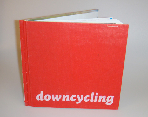 Downcycling: the medium is definitely the messageThis book uses text from “Cradle to Cradle; Remaking the Way We Make Things” by William McDonough and Michael Braungart. “Scrap” paper that has only been used on one side creates an interesting juxtaposition with the text, adding
another layer of information to the book. The book cover is made out of used materials to introduce the content of the book and to add to the tactile feel of the piece.
Downcycling: the medium is definitely the messageThis book uses text from “Cradle to Cradle; Remaking the Way We Make Things” by William McDonough and Michael Braungart. “Scrap” paper that has only been used on one side creates an interesting juxtaposition with the text, adding
another layer of information to the book. The book cover is made out of used materials to introduce the content of the book and to add to the tactile feel of the piece.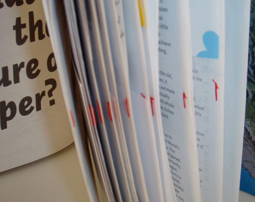 Downcycling: the medium is definitely the messageThis book uses text from “Cradle to Cradle; Remaking the Way We Make Things” by William McDonough and Michael Braungart. “Scrap” paper that has only been used on one side creates an interesting juxtaposition with the text, adding
another layer of information to the book. The book cover is made out of used materials to introduce the content of the book and to add to the tactile feel of the piece.
Downcycling: the medium is definitely the messageThis book uses text from “Cradle to Cradle; Remaking the Way We Make Things” by William McDonough and Michael Braungart. “Scrap” paper that has only been used on one side creates an interesting juxtaposition with the text, adding
another layer of information to the book. The book cover is made out of used materials to introduce the content of the book and to add to the tactile feel of the piece.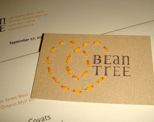 Bean Tree BrandingBean Tree is a store specializing in truly environmentally responsible products. The store's identity and press materials speak to these values through hand made details and natural materials.